Abeja District Phase Four, Signage & Wayfinding

Photo Courtesy of BDP Quadrangle
A master planned community like no other
Client: Cortel Group
Design Team: David Schellinger, Gelare Danaie, Daniel Puppin, Karen Zwart Hielema, Matt Ziyaee
Prime Architect: BDP Quadrangle
Project Completion: On-going
The Abeja District Project’s goal is to create a holistic, sustainable community. Located at Jane Street and Rutherford Road, this master-planned development is envisioned as a vibrant hub of life and activity, blending new condos, mixed-use, and commercial spaces into a dynamic urban fabric.
We began our work on the Abeja Wayfinding System for Block Four of the development with three towers, by looking to the larger planning context for the development, encompassing both the parcels under Cortel Group control as well as the surrounding city context.
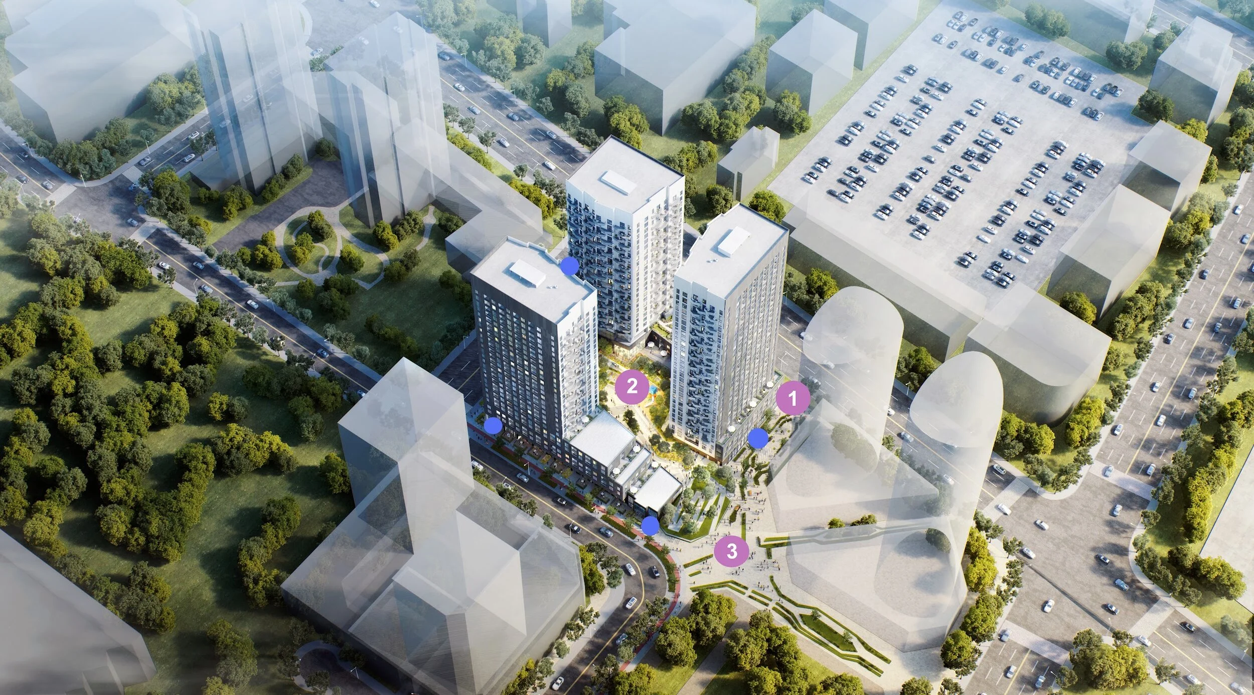
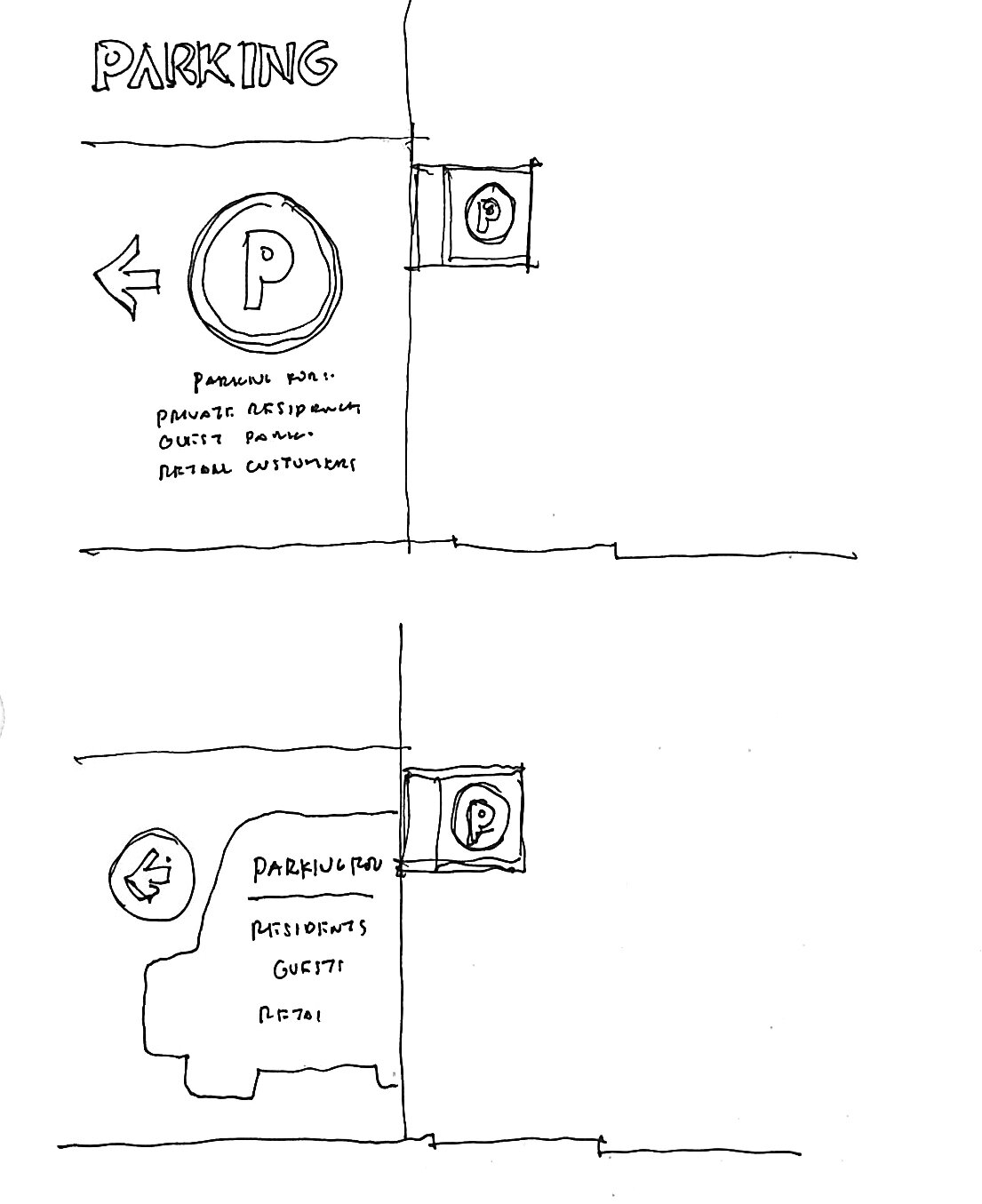
By documenting the expected master flow patterns for various types of users, we can better understand how people come to the site though public transportation or private vehicles, on foot or on bike. These flow patterns then help us to identify decision nodes, where different users and/or modes may come together, which would most benefit from having strong directional signage, branded experiences as well as public art.
Wayfinding Pyramid
We looked at the different routes that people would take to go between each of the nodes and how the wayfinding can be further enhanced through the views to nodes or the addition of signage elements. Lastly, we looked at the type of character that will be found in the collective spaces, to see where we can further enhance the character through branded environments that incorporate, architecture, landscape, signage, and public art all together. These places are identified as opportunities for what we are calling “placemaking”
1. Certainty (Identity and Code Signage)
2. Navigation (Directional Signage)
3. Delight (Monumental Signage, Branded Environments and Public Art)

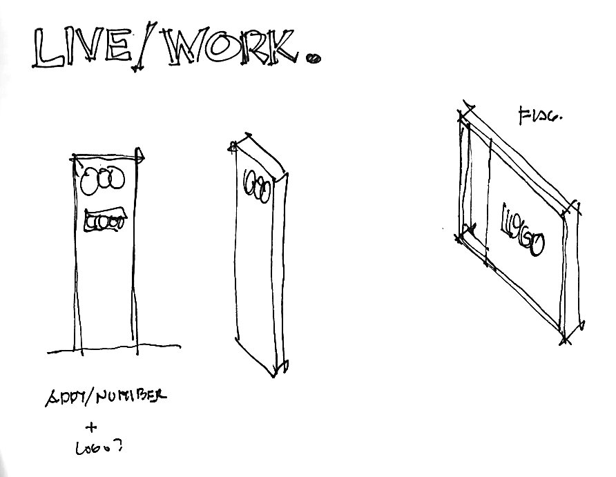
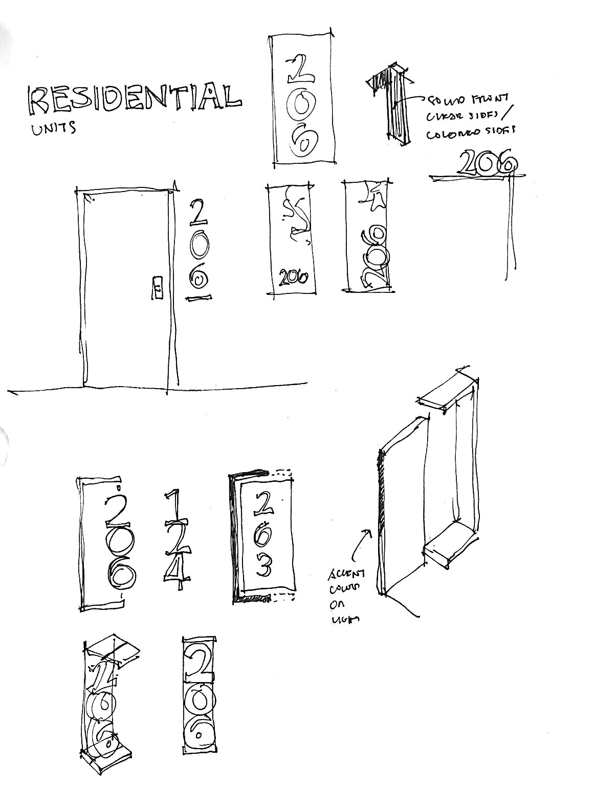
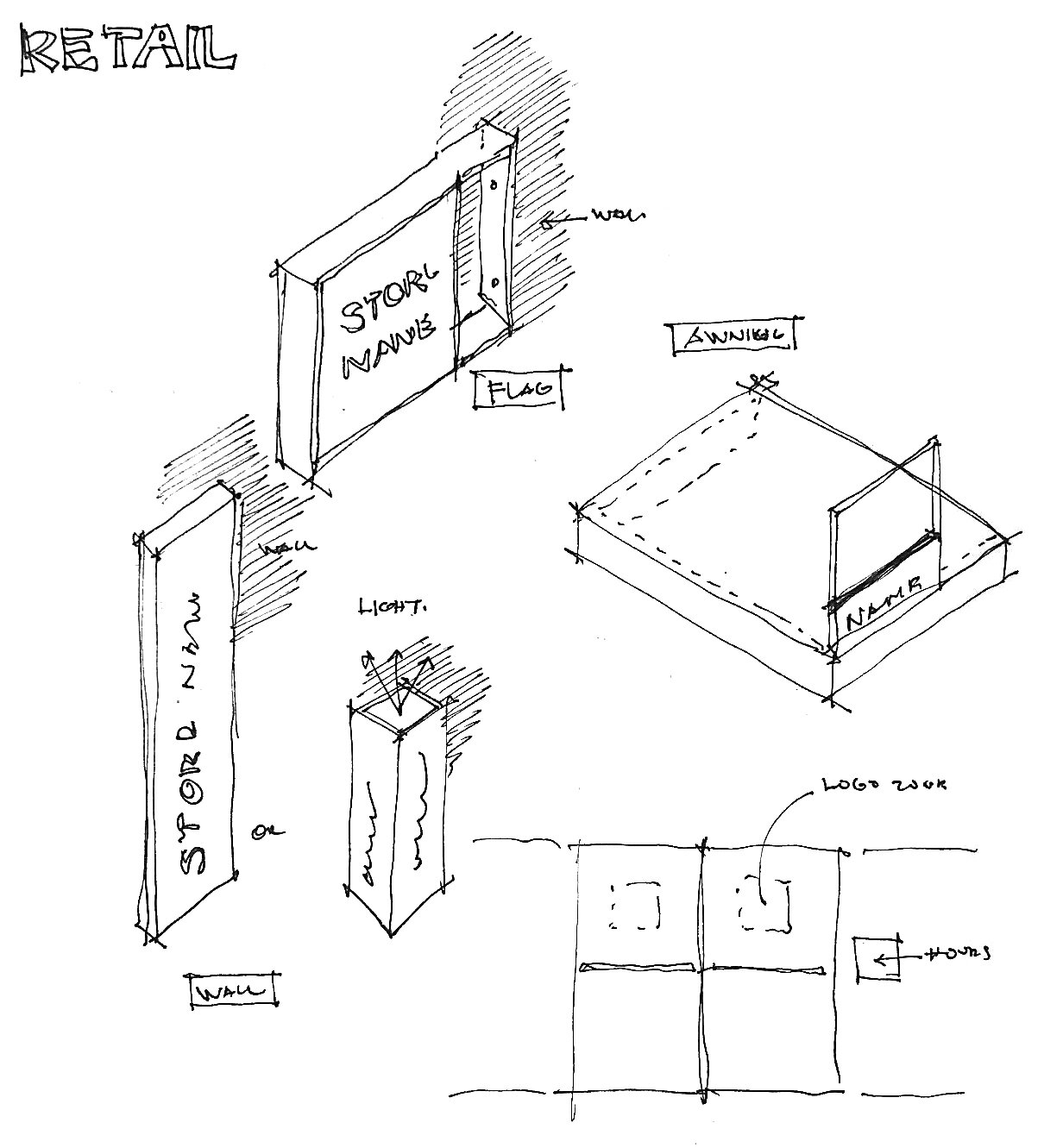
Wayfinding and Brand
Abeja district block four is designed with a creative architectural theme which is simple, black with clean lines outside and playful light-colored with a beehive balcony looking inside. After a round of design collaboration meetings with the architects, landscape, and the project team, the decision was to keep the wayfinding graphic design as minimal, simple, and elegant as possible.

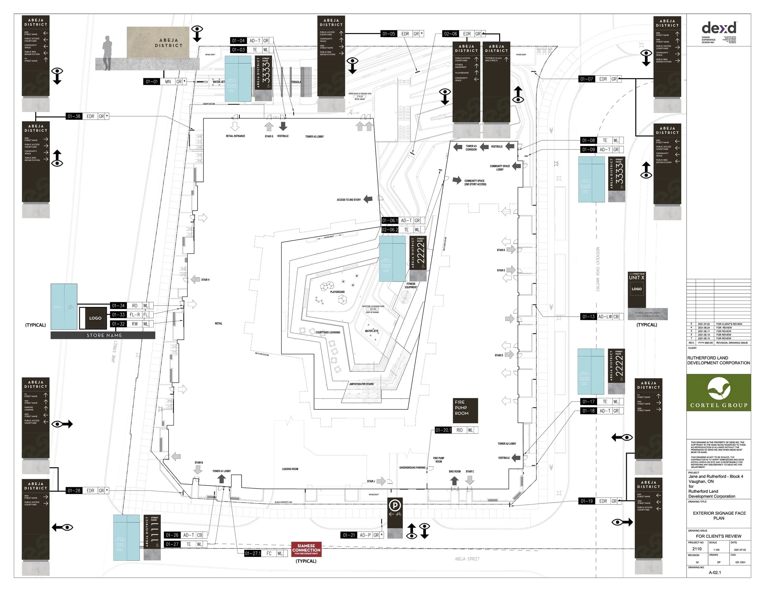
Our first design inspiration comes from the overall exterior look for the building, which is rendered in a darker monotone black/blue palate. As such, our signs work with a matte black color for the base of the exterior signs, with white illuminated messaging for increased legibility.
The exterior signs incorporate abstract elements of the Abeja logo in a tone-on-tone contrast to provide a subtle yet rich level of detail without compromising the elegant nature of the signs overall. For feature signs such as our monument sign along the public right of way, we drew inspiration from the Spanish heritage of the development by incorporating large slabs of Spanish Stone (or other similar stones) that are a signature building material of most Spanish architecture.

The interior design character of the building lobbies are rendered in a playful environment with a colorful and textured pallet. As such, our use of the base black signage works well to help stand out from the visual noise and provide clear focus on the directional messaging as much as possible.