Why Does Typography Matter in Wayfinding Design?
By Majid Abbasi
Abstract: Typography in wayfinding is a functional system that shapes legibility, hierarchy, and navigation. Decisions on typeface, spacing, scale, and contrast—along with color and negative applications—ensure visibility in varied conditions, including movement and distance. Effective typography reduces cognitive load, supports accessibility, and enables clear, consistent communication across complex environments.
In wayfinding systems, typography is not merely a visual choice—it is a functional tool that guides movement, decision-making, and spatial understanding. Whether in a hospital, transit hub such as airport terminal and train station, or public campus, people rely on typographic clarity to navigate efficiently, often under time pressure or distraction.
Typography in this context operates as a system rather than a series of isolated decisions. A well-structured typographic system reduces cognitive load and allows users to focus on navigating the space rather than decoding the message.
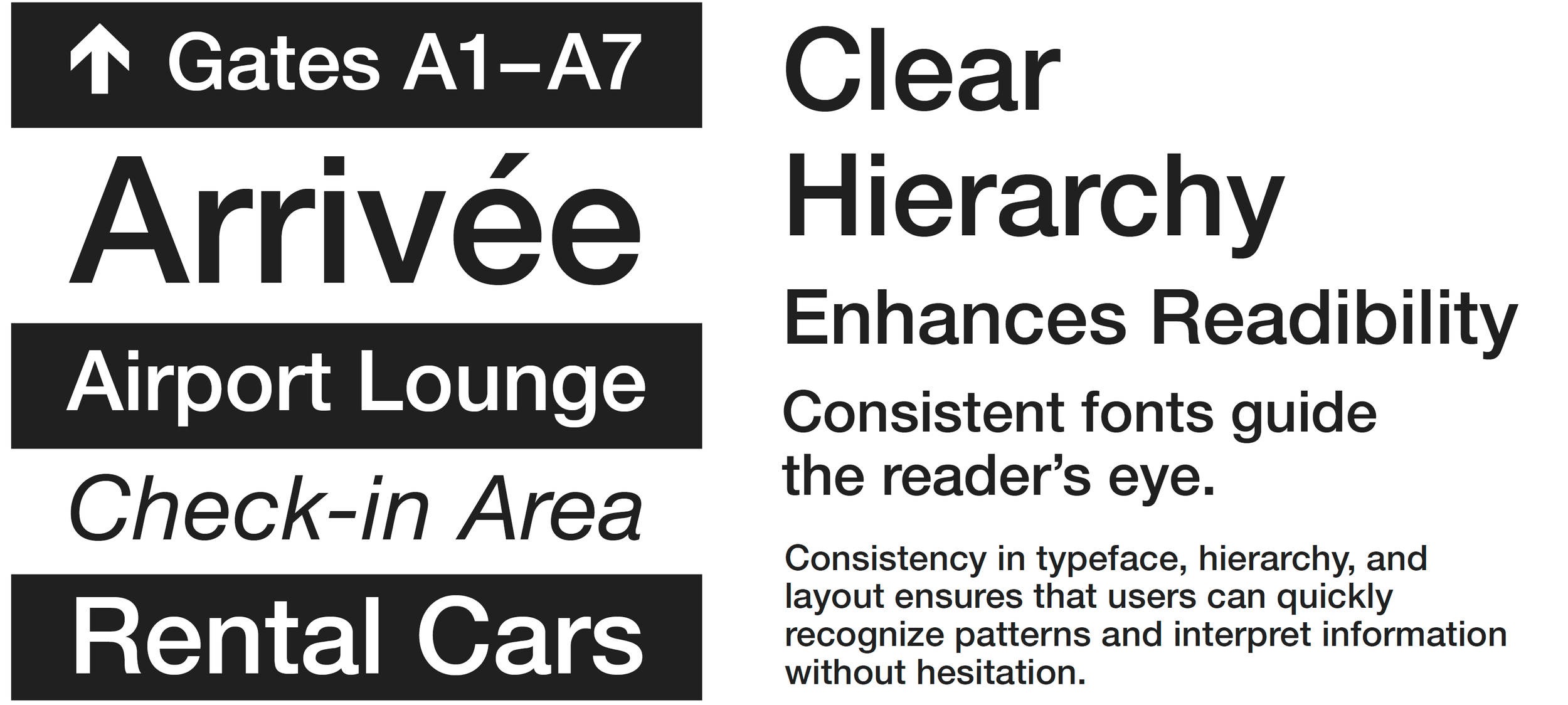
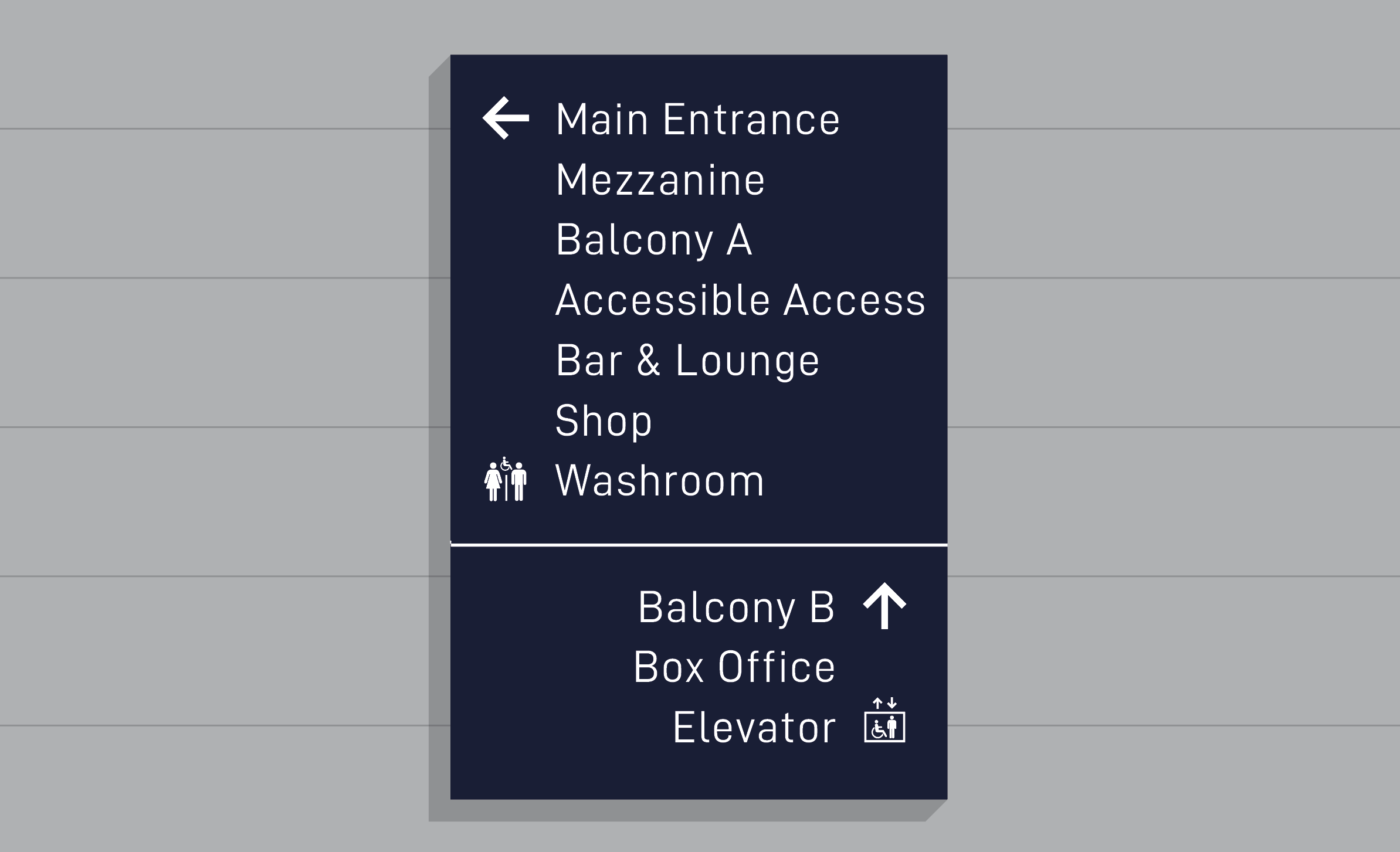
Several key variables directly influence performance. Typeface selection affects both tone and legibility; a neutral, well-designed sans-serif often performs best in complex environments. X-height plays a crucial role in readability, especially at a distance. Spacing—whether in letterforms, words, or lines—impacts how quickly information can be processed. Weight and contrast help establish hierarchy, guiding the eye toward the most important information first. This includes the relationship between text and background—whether dark text on a light surface or reversed (negative) type on a dark background.
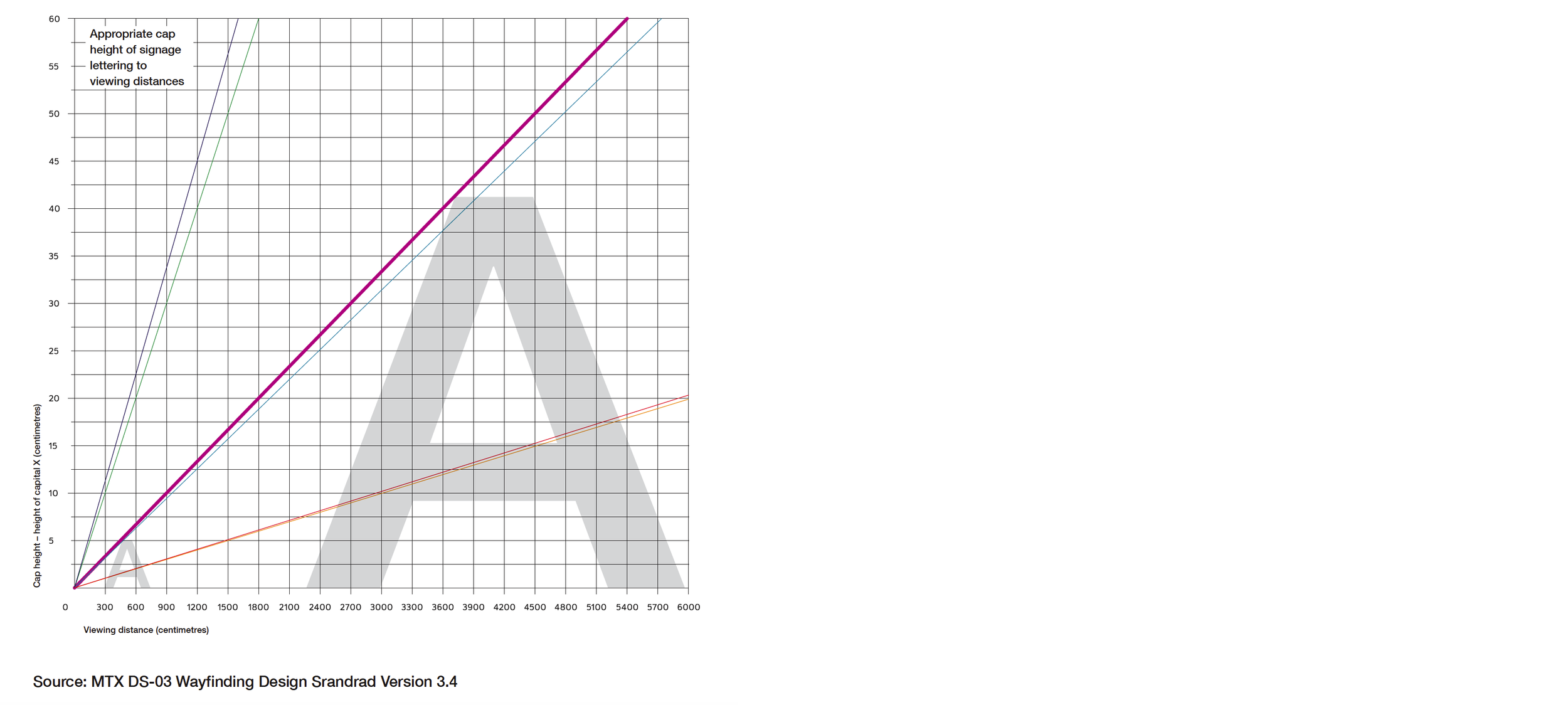
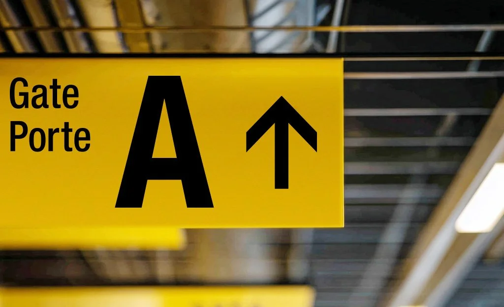
Scale and viewing distance further complicate these considerations. Unlike reading a book or screen, wayfinding typography is often read in motion. In interior environments, users may be walking, turning, or scanning quickly. In exterior signage—particularly in public spaces—typography must sometimes be legible from a moving vehicle. Entry and exit signs, for example, need to be recognized and understood within seconds, at speed, and from varying angles. This demands larger type sizes, higher contrast, and simplified messaging.
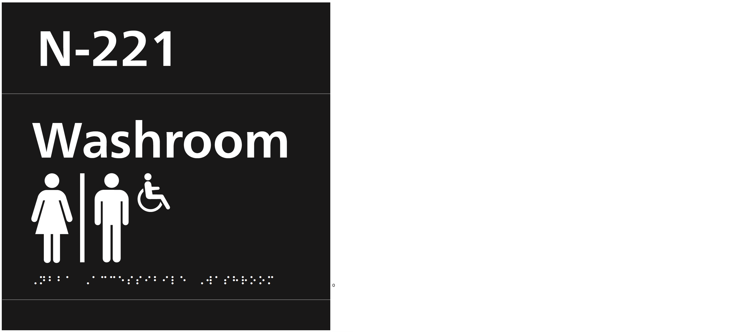
Accessibility is also essential. Effective wayfinding design considers a wide range of users, including those with visual impairments. Adequate contrast, clear letterforms, and logical hierarchy contribute to more inclusive environments. Importantly, typography should work in conjunction with other elements—such as icons and color—rather than relying on text alone.
Weight and contrast help establish hierarchy, guiding the eye toward the most important information first. This includes the relationship between text and background—whether dark text on a light surface or reversed (negative) type on a dark background. In many cases, especially in low-light or exterior conditions, high-contrast combinations are essential for visibility at distance and speed.
Ultimately, typography in wayfinding is not about style; it is about clarity, consistency, and performance. When designed thoughtfully, it becomes an invisible yet essential layer of communication—one that enables people to move confidently through space.